Saturday, May 28, 2011

Off meal plan (junior year roundup)

Out of 3 months' worth of posts on this blog, the most viewed post (I love the blogger stats feature!!) has been this one on the difference between Brown's meal plan and my being off meal plan. I fond that really interesting, because I thought that some of the other graphs were more interesting (at least, I had more fun making them). But I guess $$$ issues are always going to be taken seriously.

About a week ago meal plan ended - i.e. dining halls closed and everyone was left to fend for themselves. So now I had exact numbers to compare for meal plans vs. feeding myself for an equivalent amount of time. And then I waited around for a week waiting for research plans to be approved, etc - giving me time to graph them. I think this graph is a bit of an improvement over the last because it shows actual values, and puts the numbers in terms of things that are a bit more tangible, especially to students. Also, it has many colours! that I think (and hope) complement the numbers rather than distract.

Some of these things are probably more relevant to me (I bought my ticket to Quito, Ecuador a few weeks ago, and the rent/average grocery expenditure numbers are mine) but I think

Also, this doesn't even touch on what happens when you compare costs of living and focus just on basic needs...I pay $38 a month to feed and educate a little boy in Indonesia, and the $2174 would support him for 57.2 months = almost 5 years. He would be 12 years old before that money ran out.

Wednesday, May 25, 2011

The world according to Wikipedia

This is not-a-graph that is the direct result of this xkcd comic*, which has the following gem in the mouseover:
Wikipedia trivia - if you take any article, click on the first link in the article text not in parenthesis or italics and then repeat, you will eventually end up at "Philosophy."
It is true probably because the first paragraph of every article attempts to put the topic in a wider context, which means the first link will probably lead to a topic broader than the previous one, and all roads lead back to how we organise information and knowledge, and how we think -- philosophy!!

But what is just as interesting is how all those paths converge. So I did some clicking around, and came up with this diagram. It traces fields of study (=majors, ="concentrations" because Brown needs to be special) offered at the undergraduate level at Brown University (see a list here) through the Wikipedia maze and shows how they all converge onto philosophy. This is an incomplete selection of concentrations because not all would fit, and I excluded 'sub-field' concentrations e.g. biochem, biophysics, geo-bio...with the exception of marine biology, which is my concentration and therefore I am obviously biased toward wanting it in there.

Interestingly enough, there are only 3 links into philosophy for 40+ fields of study mapped, and the third link only includes one field, education. Everything else eventually goes back to math or to academia, academic communities and interactions. Some paths are also surprisingly weird...check out engineering and business studies. Business studies is linked through 'planet' but astronomy isn't.


*it is also the result of Jenni posting this on Facebook so that I was thoroughly distracted for the rest of the night and did no studying for my GRE. so this entire post is her fault.

Monday, May 23, 2011

Graphing finals

I have been busy studying for the past two weeks or so, but finals are over, grades are in and I am all moved out of my dorm and essentially waiting for the summer to really begin. I am supposed to be up in Nahant, MA running transects for algal biomass but I don't have an approved dive buddy to work with yet so I am stuck here in Providence for now.

So I decided to make some graphs and look at the thing that sapped the last couple of weeks of my life...finals! Armed with Brown's final exam schedule and course enrollment numbers from Banner, my plan was to look at how the number of exams taken (=number of people taking exams) changes over time, by department. Unfortunately, that was far too hard to make any sense of - data overload and lines everywhere. So I changed my analysis a little.

First of all: Here is a simple graph of the total number of exams taken by department. As you can see, the econ department gives out the most exams by far, with the biology department coming in a distant second.


This kind of follows my original idea of tracking number of exams over time in a more manageable way. Brown follows an exam schedule that has two final exam sessions a day (9am and 2pm) and so exam session 1 on the graph corresponds to 9am on May 11 and session 18 to the very last session, 2pm on May 20. The black line is the trend for all departments combined, which is pretty close to a straight line. I also plotted the data for selected departments/areas in comparison. It looks like it is a good thing to be taking math and humanities classes because an average you get done early, whereas it's not so great to be doing econ or political science, and it sucks to be taking physics (I know; I took physics and its very-last-day final).
I admit that lumping all the humanities together is completely arbitrary and reflects my science bias...oh well, I don't think humanities people take that many exams anyway. And the final exam schedule does not give any information about final papers, etc.

Sunday, May 8, 2011

The General Election, in Facebook-land

Thanks to the General Election I was supremely unproductive yesterday. I am actually not 100% sure what I feel about the results themselves. But there is change in the air that makes it hard not to be excited. And I am optimistic enough to believe that the change will be for the better.

Anyway, there has been a lot said about the role of social media in this election. I was certainly thinking that as I watched the updates roll in on Twitter while Channel News Asia did their millionth 'analysis' of the constituencies and candidates and then started talking about Osama and golf results (!?!). But sometimes the role of social media can be a little...overblown?

I did a brief survey of a bunch of Facebook fan pages this morning, and here is what I found.

(data correct at time of collection, ~10am EDT; almost certainly no longer correct)

So apparently the returning officer who has burned "pursuant to Section 49, Subsection 7E, Paragraph A of the Parliamentary Elections Act" into our brains forever is better liked than the PM. The ranting can start now.

I will add that if you use Facebook likes as an actual measure of things liked, I am like that grumpy old man who hates the world and waves his cane at small children. For the record, I actually like small children, except on planes.

Saturday, April 30, 2011

People you may know

The 'people you may know' feature on Facebook is fascinating and creepy. I guess you could say the same for many things that Facebook does, like telling you where and when you met someone based on a series of assumptions. Anyway, the point is that the little friend-suggestion sidebar is always staring at me, and I have looked at the expanded page a couple of times before, but I decided to take a more detailed look at what it was up to.

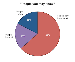
I scrolled down the page and took notes on (1) which row of friend suggestions each person showed up in, where the top row = 1; (2) the number of mutual friends reported; and (3) whether I actually knew the person. Here, I categorised "people I know" as someone I would recognise and talk to if I ran into them on the street, and who would most likely do the same. "People I know of" are generally people I know of through other people and may have met once. I might recognise them on the street but talking to them would probably be awkward or creepy. I scrolled and recorded until I got bored of scrolling and writing, which is of course an extremely systematic way to collect data. But that came up to a decent sample of 242. It turns out I don't know most people on that page.
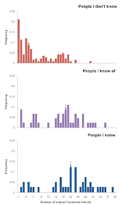
When it suggests people it thinks you might want to 'friend', Facebook tells you how many Facebook-friends you have in common. So I took a look at how good an indicator this actually is for predicting if you actually know someone. Here are the distributions for the number of Facebook-friends I had in common with people that were suggested, sorted by whether I knew them. The arrows indicate median values. The median number of mutual Facebook-friends did increase across the categories, though they are similar for people I know and people I know of.
But the real question is, how well does Facebook's metric of 'number of mutual Facebook-friends' predict whether I might actually want to be Facebook-friends with friend suggestion X? That's the basic purpose behind this annoying little sidebar on Facebook, right? So I collapsed the first two categories (people I don't know and people I know of...but not enough to be a 'friend' and not a creeper) into one where "Consider Facebook-friending = 0" and the third category of people I know was "Consider Facebook-friending = 1*"

Here is a logistic regression I ran in Stata with the number of mutual friends as a single predictor. It actually turns out a statistically significant relationship (P<0.001) that is not a particularly good fit to the data. But on average, I get a 13% increase in the odds that I will actually be interested in friending someone with every one more mutual Facebook-friend.
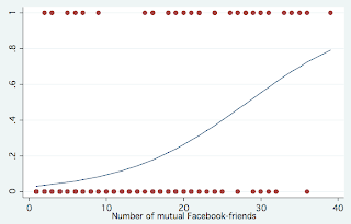
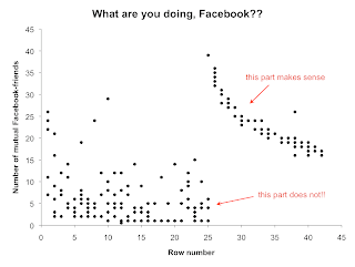
I guess that is basically saying what everyone kind of knows already: that if you have more friends in common with someone, you are more likely to know them, even in Facebook-world. So if Facebook was aiming to suggest people that you are likely to click on/friend on its "people you may know" page, it would start the list with people who had more mutual Facebook-friends and go down from there, right? I guess not. This is what I got plotting the number of mutual friends for each person against how far down the page they were (row number). It is rather strange. There is a nice negative relationship starting at the 26th row (a point which any person who wasn't looking for useless data would be unlikely to get to) and a big mess in all the top rows. I have no idea what is going on here...


* I did not actually friend any of them. There are already too many people on my facebook.

Thursday, April 28, 2011

Student activity monitor!

The blog has been quiet for a while, but I've been putting that time to good use by collecting data. Some time ago I realised that this little panel on the MyCourses* page had been staring at me all along. It tells you how many people from each of your classes are logged on to the system (and you can see who they are). So I basically have a way to track student activity over time. Over the past 2+ weeks I have been recording the time and the number of online students by course every time I logged on, with at least 20-minute intervals between consecutively recorded data points.


The UCS, UFB and CCB Elections category is a dummy course that contains candidate statements, endorsements, etc. for the elections and presumably, all undergraduates are 'enrolled' in this dummy course on the system. This gives me a large enough sample to look at general patterns of student activity over a general 24 hour period on a weekday. It is actually quite interesting! It looks like peak hours of academic activity are in the mid-afternoon 2-3ish and at night. In the morning there is a steep increase from 9 to noon and there is a noticeable drop around dinnertime.

Of course, this is as much of a graph of my own activity as of general student activity (since I can only get the numbers when I log on to the system myself). I am almost never up past midnight and I generally get up between 7 and 7.30am so there is a big data hole between midnight and 7. I would love to fill in some of it, particularly the 12mn to 2? 3? 4? am part because I want to know what time the number starts falling and people go to bed. But my sleep > data on other people's sleep so I may never know. (If you are a late night-early morning worker and want to help me collect data on this you are most welcome to!)

Breaking it down by class, these are trends for physics 40 (which I take) and bio 42 - ecology (which I TA). These are standardised by the total class size (physics has slightly more than 3 times as many enrolled students as ecology). They both show similar trends of steep increase in the morning, but are much more variable for the rest of the day (though if you take the average it would be pretty much a straight line from noon to midnight). My favourite part about these graphs are the outliers :)

I think this is something worth looking at again next semester, over a longer period of time. It might also be fun to compare weekends vs. weekdays and...so many things.


*people from Singapore: MyCourses is pretty much exactly like the NUS IVLE, but with a clunkier interface.

Sunday, April 17, 2011

Algae people!

I attended my second scientific conference in five weeks (also my second conference EVER) this weekend: the 50th anniversary symposium of the Northeast Algal Society at Woods Hole. As might be expected from a group that focuses on algae, this was a much smaller, intimate conference than the Benthic Ecology Meeting, and they gave everyone a full list of attendees' names, affiliations and contact information. AKA graphable data. So here we go...

I wanted to look at where people were from, i.e. which institutions sent the most algae people out to Woods Hole. This graph is something similar to a rank abundance curve, with institutions ranked by the number of attendees on the abscissa and the number of attendees on the ordinate (the terms 'abscissa' and 'ordinate' make me happy because though they are so ridiculously obscure). The institutions with the biggest contingents were: University of New Brunswick, UConn, URI, UNH and Northeastern. I was the only one from Brown :)


Here is a plot of how far people were from their home institution. It is based on point to point distance measurements in Google Earth, so it most certainly underestimates the actual distance traveled by each person (especially because Cape Cod is a funny shape).


Woods Hole is awesome and today was sunny so I was very happy. Here is a picture from near the conference building.