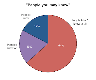
I scrolled down the page and took notes on (1) which row of friend suggestions each person showed up in, where the top row = 1; (2) the number of mutual friends reported; and (3) whether I actually knew the person. Here, I categorised "people I know" as someone I would recognise and talk to if I ran into them on the street, and who would most likely do the same. "People I know of" are generally people I know of through other people and may have met once. I might recognise them on the street but talking to them would probably be awkward or creepy. I scrolled and recorded until I got bored of scrolling and writing, which is of course an extremely systematic way to collect data. But that came up to a decent sample of 242. It turns out I don't know most people on that page.
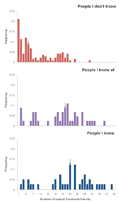
 When it suggests people it thinks you might want to 'friend', Facebook tells you how many Facebook-friends you have in common. So I took a look at how good an indicator this actually is for predicting if you actually know someone. Here are the distributions for the number of Facebook-friends I had in common with people that were suggested, sorted by whether I knew them. The arrows indicate median values. The median number of mutual Facebook-friends did increase across the categories, though they are similar for people I know and people I know of.
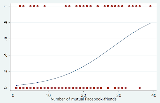
 But the real question is, how well does Facebook's metric of 'number of mutual Facebook-friends' predict whether I might actually want to be Facebook-friends with friend suggestion X? That's the basic purpose behind this annoying little sidebar on Facebook, right? So I collapsed the first two categories (people I don't know and people I know of...but not enough to be a 'friend' and not a creeper) into one where "Consider Facebook-friending = 0" and the third category of people I know was "Consider Facebook-friending = 1*"
Here is a logistic regression I ran in Stata with the number of mutual friends as a single predictor. It actually turns out a statistically significant relationship (P<0.001) that is not a particularly good fit to the data. But on average, I get a 13% increase in the odds that I will actually be interested in friending someone with every one more mutual Facebook-friend.
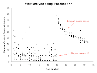
 I guess that is basically saying what everyone kind of knows already: that if you have more friends in common with someone, you are more likely to know them, even in Facebook-world. So if Facebook was aiming to suggest people that you are likely to click on/friend on its "people you may know" page, it would start the list with people who had more mutual Facebook-friends and go down from there, right? I guess not. This is what I got plotting the number of mutual friends for each person against how far down the page they were (row number). It is rather strange. There is a nice negative relationship starting at the 26th row (a point which any person who wasn't looking for useless data would be unlikely to get to) and a big mess in all the top rows. I have no idea what is going on here...
* I did not actually friend any of them. There are already too many people on my facebook.
