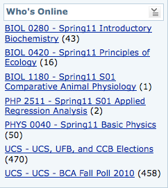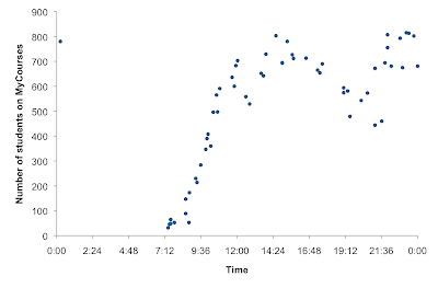
The UCS, UFB and CCB Elections category is a dummy course that contains candidate statements, endorsements, etc. for the elections and presumably, all undergraduates are 'enrolled' in this dummy course on the system. This gives me a large enough sample to look at general patterns of student activity over a general 24 hour period on a weekday. It is actually quite interesting! It looks like peak hours of academic activity are in the mid-afternoon 2-3ish and at night. In the morning there is a steep increase from 9 to noon and there is a noticeable drop around dinnertime.
Of course, this is as much of a graph of my own activity as of general student activity (since I can only get the numbers when I log on to the system myself). I am almost never up past midnight and I generally get up between 7 and 7.30am so there is a big data hole between midnight and 7. I would love to fill in some of it, particularly the 12mn to 2? 3? 4? am part because I want to know what time the number starts falling and people go to bed. But my sleep > data on other people's sleep so I may never know. (If you are a late night-early morning worker and want to help me collect data on this you are most welcome to!)
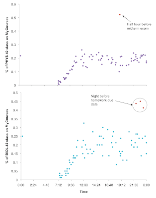
 Breaking it down by class, these are trends for physics 40 (which I take) and bio 42 - ecology (which I TA). These are standardised by the total class size (physics has slightly more than 3 times as many enrolled students as ecology). They both show similar trends of steep increase in the morning, but are much more variable for the rest of the day (though if you take the average it would be pretty much a straight line from noon to midnight). My favourite part about these graphs are the outliers :)
 I think this is something worth looking at again next semester, over a longer period of time. It might also be fun to compare weekends vs. weekdays and...so many things.
*people from Singapore: MyCourses is pretty much exactly like the NUS IVLE, but with a clunkier interface.
ahhhhhh this is so interesting!
ReplyDeletemycourses is creepy.
Natalie, your blog is so cool!
ReplyDelete